Have you ever had your design set to just the perfect color on your screen, but when you went to print it came out different than what you see on the screen? There are many different factors that play a role in the color variation from screen to print out. One of the most dominant factors in the color change is the conversion from RGB to CMYK.
RGB stands for Red, Green, & Blue color variations, which is what monitors use to display color. CMYK stands for Cyan, Magenta, Yellow, & Black color scheme, which is what printers use. As shown below, you can see how the different colors models are depicted.
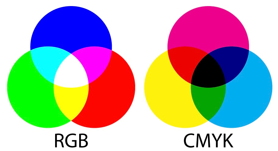
| RGB: Red, Green, Blue | CMYK: Cyan, Magenta, Yellow, Black |
|
|
| Red + Green + Blue = White | Cyan + Magenta + Yellow = Black |
In addition to the color model difference between your display and prints, there are some other factors that could be affecting your color. A few of those reasons are:
- Ink Layering & Overlapping – This causes subtle shifts in the colors that you don’t find happening in the pixels that make up your screen image.
- Saturation & Contrast – Prints don’t have the same level of saturation and contrast that a monitor has. Prints are typically darker and less vibrant than what is shown on your display. Paper texture can affect the level of brightness, making a big difference in your results.
- White-Point Mismatch – This means that the white color on your paper isn’t the same white color you see on your screen. The majority of the time you’ll see the difference is quite obvious.
What can you do about this issue?
Now that we’ve explained a bit about the reasons for the color differences from monitor to paper, we’re going to talk about what can be done.
#1 – One of the first things to check is the calibration of your monitor’s color settings, as well as any drivers that may be needed to support the display properly. Next, you should confirm that you have properly installed the correct drivers for your printer as well. Within your printer driver settings, you’ll find controls for fine-tuning the overall appearance of the color output. Depending on what you’re looking to get, this may be sufficient.
#2 – If you are particular about your colors and need them as accurate as possible, a common solution is visiting your local printing service. Commercial printing companies deal with this issue on a regular basis and have the solutions you need at an affordable cost.
#3 – Often printers come with a Pantone Color Bridge swatch book that can be used as a reference to match colors as closely as possible to your desired color. This color bridge will show you the Pantone ink colors right next to its closest match in the CMYK digital printing spectrum.
We hope this article was useful in helping you determine what the issue may be in your color differences from screen to prints. Whether you’re creating business cards, logo designs, celebratory invitations, or whatever else it may be, we wish you the best in your creativity and designs!
This article was written by SaltLakePrinting.com